Last Sunday I was at the OSA booth at “Art in The Pearl”, 
doing a demo on white flowers. 
There was a time when I avoided painting white flowers, especially with white backgrounds… 
it was difficult to give them interest and definition. 
But that was because I thought shadows should be gray.
Then I discovered a wonderful thing 
about white flowers… 
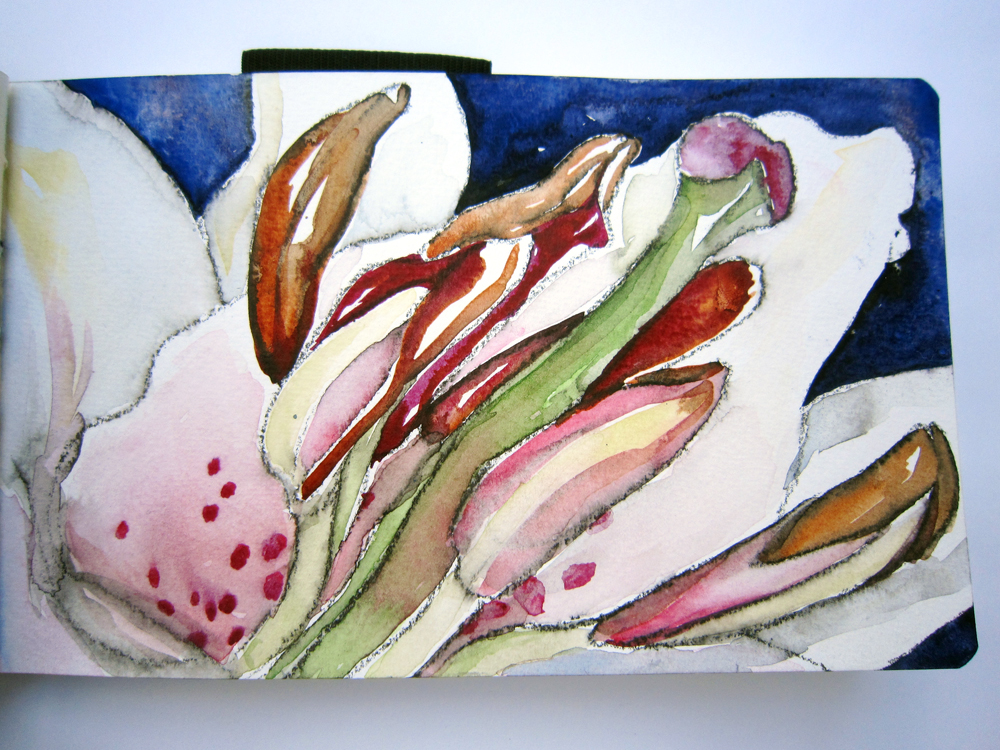
                     they can be any color you want to make them! As long as the values are true, 
the color is believable. In other words, white flowers are better
with colorful shadows and reflected color. 

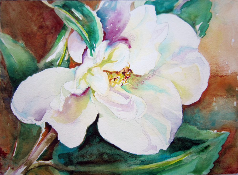
Take these Sasanqua Camellias.
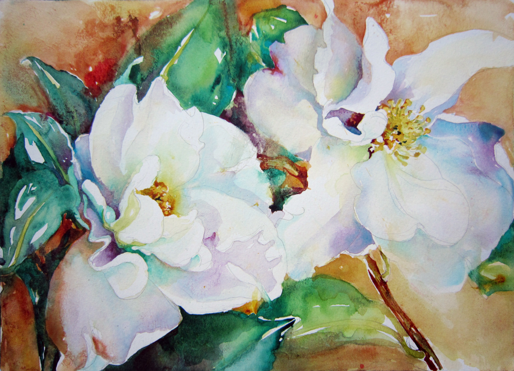
The color in the petals make them appear almost translucent!
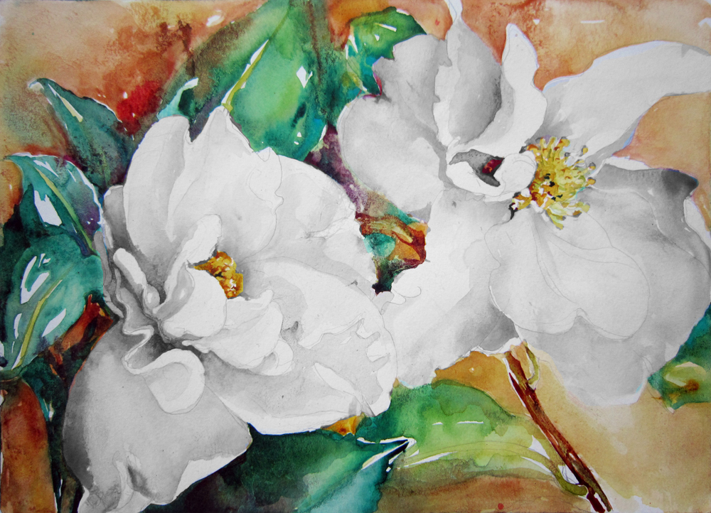
Without the color, above, the shadows are just gray.
See how flat this looks compared to the first one?
 
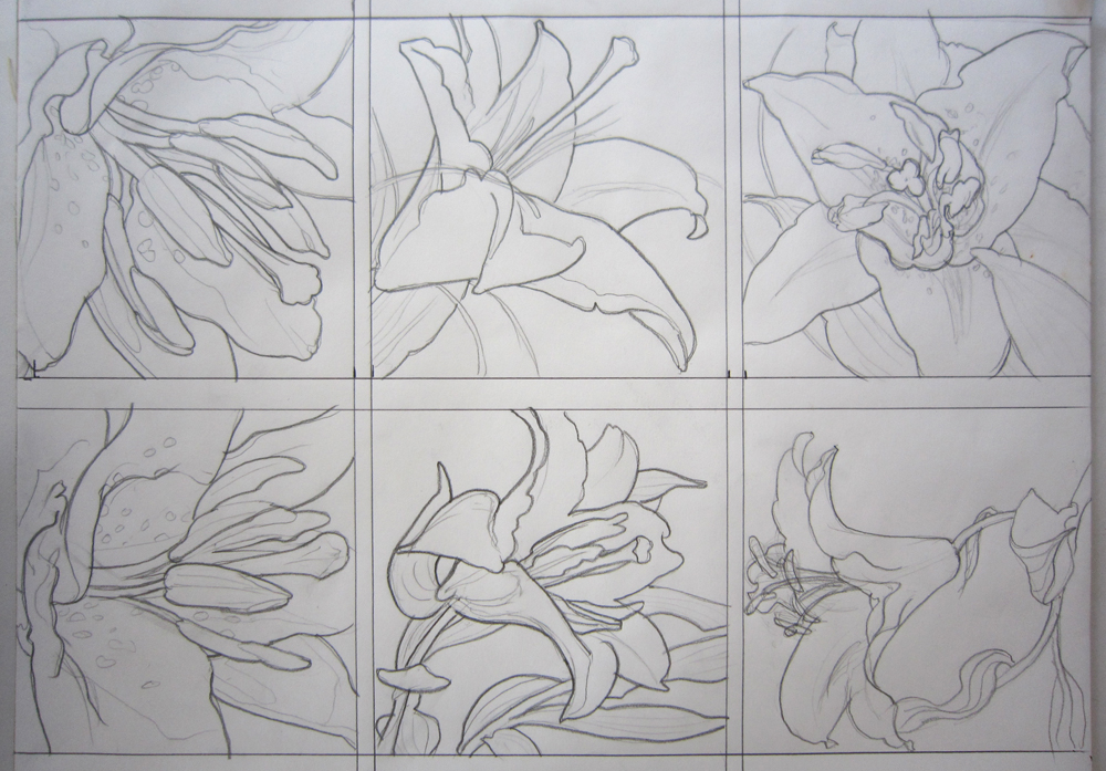
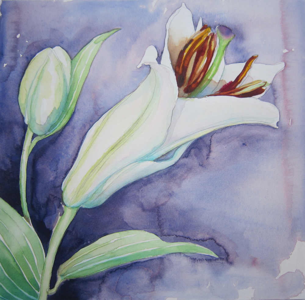
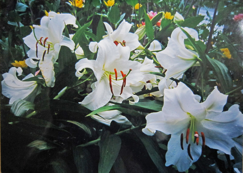
Same thing with these lilies. White doesn’t have to be boring or drab. 
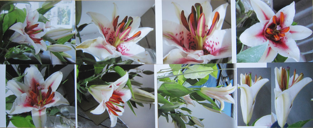
For the lily above, I used one of the lilies in the photo below. Can you find the one? 
It’s the flower in the center, cropped out (and rotated) below, right.

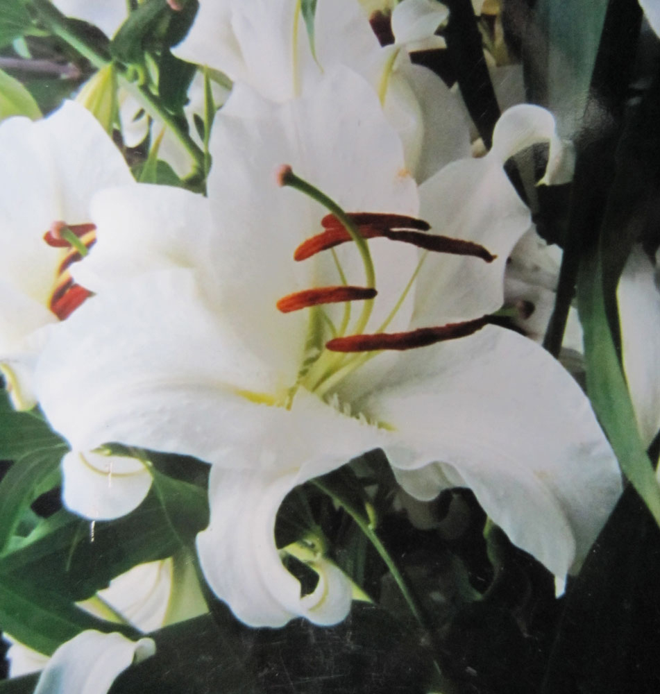
 I like it’s curves — the twisting shape 

the contour makes — and have used the same basic form 
in several paintings.

I’m delighted to say the 3-day botanical workshop at Oregon Society of Artists went very well.  Here’s a painting in progress, 10 x 10 inches, started during the workshop.

Preparing for a workshop gives me an opportunity to try things I’ve been wanting to try! This time it meant acquiring a bunch of lilies to photograph and paint. Here are some of the reference images we worked from. We also had the actual flowers to move around or photograph, and we discussed how to make a good art reference photo.

Below, a group of thumbnail sketches, or small, rough contour drawings… they’re about 6 inches across. Sketching thumbnails is a good warm-up exercise and also a useful way to think through the design process.

After choosing an image, a color study becomes my road map for a successful painting. I did a quick small version in my Pentalic Journal, below.

I’m using a variety of papers, to compare them —
      Strathmore board for wet media
      Crescent 5115 Hot press watercolor board
      Arches watercolor board
      Canson watercolor board

Right away I noticed the Strathmore (in this quick study, above) is different from the other surfaces in that it is fairly absorbent, causing the paint to soak in quickly, leaving observable edges. Notice edges in the dark background.


One good thing about the Strathmore is that both front and back surfaces are sized to paint on, whereas other boards have only one usable surface. While not my favorite, I find the surface is suitable for loose, fairly wet work. Above, I’ve used it to make a quick value study of a magnolia blossom. Since I know the surface is extra absorbent, I used enough water in the background wash to compensate.

The Crescent, Arches and Canson are all very workable for me. I still love the Crescent board best, overall. It has long been my favorite surface for workability.

But sometimes a surface with more texture is fun to play around with. I do like using Arches paper on wood cradled panels. 

I notice the Canson makes the whitest surface… it’s acid free but not 100% rag (cotton). It’s also the least expensive, and works just fine.