
My collage portrait was awarded 1st place at Oregon Society of Artist’s 200 for under $200 show by juror Paul Trapp, along with a very generous prize. It is such a fine honor, as the gallery is filled with beautiful artwork! Some of it no doubt took many loving hours to make. With a different juror or perhaps even on a different day, the prize could have gone to one of them.
I had planned to enter the painting, “Blue Fresco” read about it here — and since it sold before the show started, I got to work on a new painting — actually two of them. First I used a watercolor portrait study to mount on a wood cradled panel by American Easel, then added both Golden crackle paste and sheetrock mud to obscure it. Here it is, clearly unfinished.
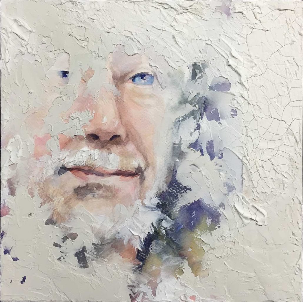
But not seeing where to take it from here, I shifted gears with another idea… a collage painting.
A large order had just come in from Nova Color. They don’t advertise and you won’t find it in art stores… If you don’t already know about Nova, they sell very high quality acrylic paint and mediums at very reasonable prices.
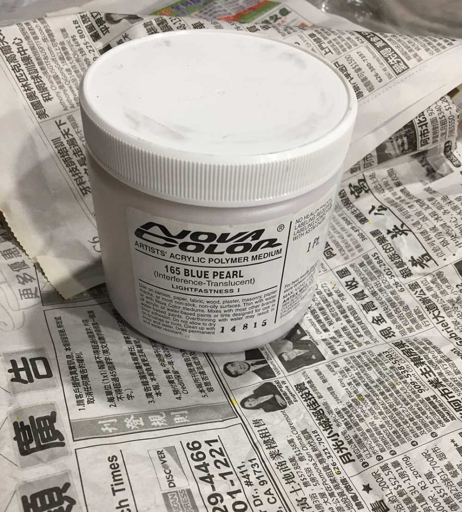
The padding inside the box happened to be Chinese newspaper — neutral grey patterning — a perfect background for a collage. Here’s a very basic thing about collage: If your subject has strong value shapes it is far more interesting. And neighboring neutrals really make color pop! Collage can often look funny, and that gets noticed. Most of the time when we paint portraits we work very hard to make them look normal, while it is the unique that draws attention.
Here’s a section from a large, painted portrait…
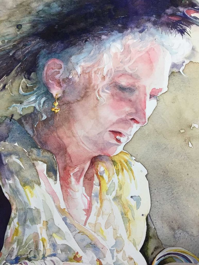
… that I made from a photo I took of Mary on hat day at Menucha, with light across the edge of her face. It has rich color and shadows.

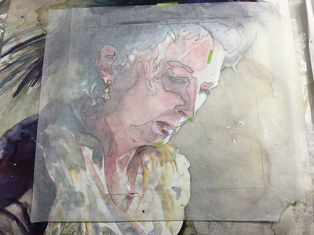
Since I’d already interpreted the image and it was the right size for my 12 x 12 panel, I simply put a layer of tracing paper over it and drew the shapes, creating a pattern for my collage.
While packing supplies for my portrait workshop at Menucha, I’d run across a bag of maps and one had the light value yellow tones I was looking for. The more intense color is from my stash of marbled paper with oranges and yellows in medium value, sandwiched with black & green strands. And I also had a piece of black marbled paper with shades of deep grey, perfect for hair. Here is my palette!

For the whites of the face I used white drawing paper.
One advantage to working in collage — you can simply layer the paper and decide if you like it before you commit. Here’s an early version when the pieces are still loose.
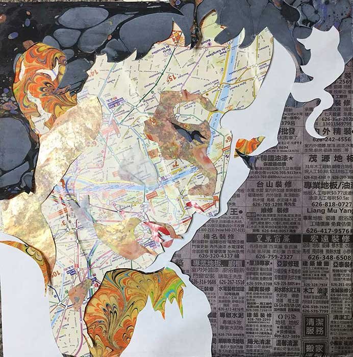
I’ve rearranged a bit and added a few more shapes for the final, below. Before attaching the map face, I ran a wash of orange watercolor over the profile. Notice I’ve simplified my shapes from the pattern — too many shapes can be less effective. I want large, medium and small shapes — the more varied they are, the more interesting.
Searching for a name, I realized the map I’d chosen was one of Paris that I’d picked up in my travels. The added color gave it a “HOT” feeling and I wanted to refer back to traveling because so much of my inspiration comes from that. Taking my final cue from the newspaper, I titled the painting “Travel Fever: Paris to Shanghai”.

Thanks to Sue Parman, for purchasing this piece, even before the awards ceremony. Yes, we both agree she has good taste!
Sometimes the question is asked, how long does it take to make a painting? The answer — it takes a lifetime! Without the experiences I’ve had up until this moment, what I’ve collected — memories, maps, marbled paper — and all the previous artwork I’ve created, I couldn’t possibly do the work I am doing now! If I added up just the hours spent actually making this collage and finishing the panel, it still took the better part of a day. But as with writing, it does speed things up to know what it is I want to say!
One other thing — while my work comes from within, it is also a product of the inspiration I borrow from everywhere around me. As you exercise your artist’s voice, I invite you to do the same…
