WHEN LESS IS MORE

The concept of ambiguity has been resonating with me for some time — the idea that telling the whole story in a painting can be, well, boring, while omitting parts of it is intriguing. Ambiguity is engaging.
It invites viewer participation as we work to fill in the blanks. My visuals editor at the Oregonian, Michelle Wise, encouraged me to create interest with unfinished paintings that showed only part of the image.
After traveling in Italy, I have also been interested in creating the feel of antiquity and have been seeking a way to express that in my art. The first time I visited many years ago, Mary Lee Damutz took us to see a ruined chapel near Lucca with a blue fresco on the back wall. It left a lasting impression.

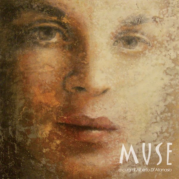
Then exploring a Tuscan village while leading a workshop there, I saw paintings by Stefania Orru in a gallery. Her contemporary works reminded me of the peeling layers of old frescoes found in Italian villas. Here is an example.
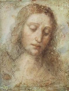
She may have been channeling Da Vinci‘s painting, above!
I’m not the only one inspired by these two concepts. After one of our Italian trips, my workshop partner Laura Shea made this painting, incorporating sheet rock mud and gold paint on canvas.

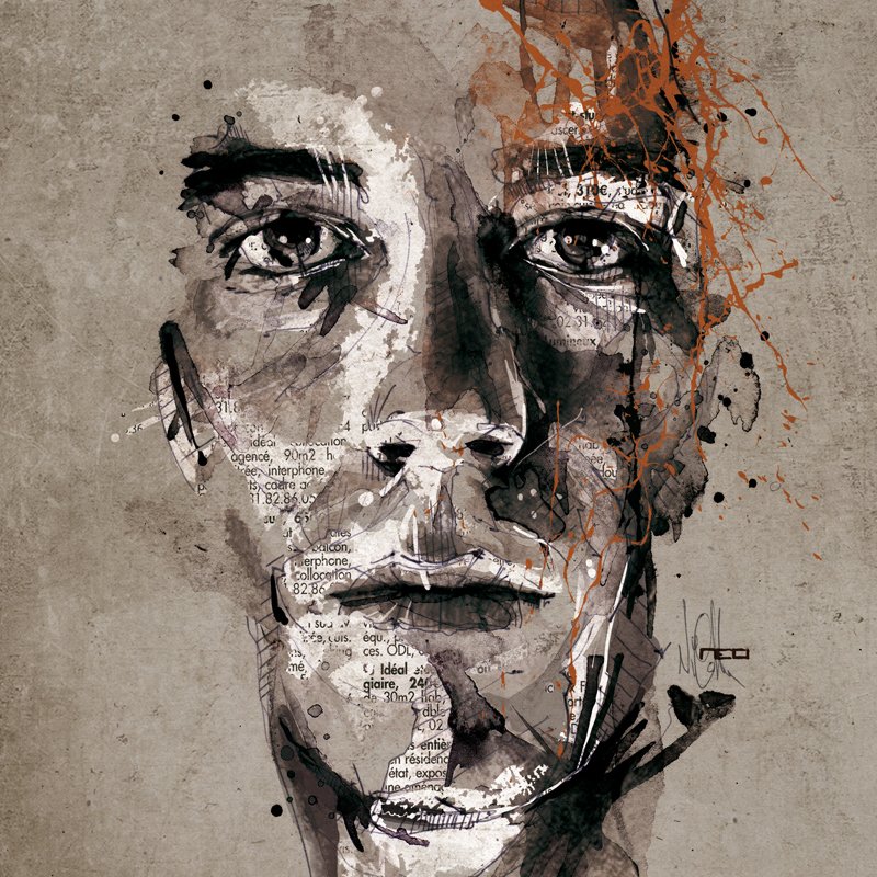
Here’s work by a French artist I just discovered on Pinterest last week, Florian Nicolle. I love how she includes newspaper and line in her work, with just a little color.
I finally had a chance to put my ideas to work last August. I’d been working with collage madonnas in Vera Dickerson’s workshop. Vera is also an wonderful instructor and here is an example of her work.

I wanted to include a portrait, and I already had one, a study that I’d painted in Lynn Powers’ first portrait workshop a few years ago, from a photo she supplied of her daughter, Kelly. I have always admired Lynn’s work and learned so much from her in a few short days. I am eternally grateful to have had the opportunity to study with Lynn. She was a master of color and technique and has left a lasting legacy.
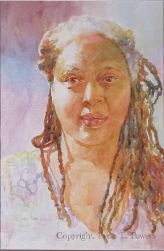
Here is one of Lynn’s paintings, “Woman of Color”.
I am the proud owner of this gorgeous print! You can find her prints available to purchase here:
So, I took my painting of Kelly and attached it to a 12×12 wood panel by American Easel. Then with a metal spatula I applied spackling paste — essentially sheetrock mud — allowing much of the portrait to show but covering the surrounding wood. When it dried, I liked the peek-a-boo effect with some of the portrait being visible. A wash of blue watercolor paint over the sheetrock simulates the blue fresco.
But it needed to be pushed further.
Having a stash of almost transparent marbled papers, I decided to imply a halo by adding bits of marbling to the background corners — essentially negative painting it with the marbled paper. Then I added a beige marbled paper with streaks of red and yellow ochre to create the illusion of shoulders and neckline. Squares of collage paper I’d made by adding Citrasolve, to National Geographic magazine pages were the final touches. Here is the result!
“Blue Fresco”
These experimental techniques are such fun to play with!
Two coats of Dorlands wax were then rubbed on the surface to protect it. This actually improved the effect by lifting a little of the spackling paste, increasing the translucency and allowing a bit more of the portrait to show.
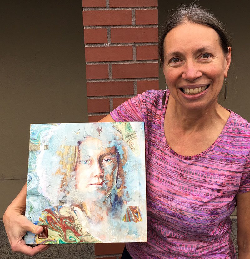
The painting elicited many comments. Seeing it on a Facebook post, Jim Powers bought “Blue Fresco” for his daughter Kelly! He took this photo of me with the painting at the WSO Convention last weekend.
I feel so honored to have this art go to Kelly and her family.
It’s good to seek inspiration from all around you, then find unique ways to translate it into your own work.
Experiment and play! Everything you do today informs your future work.
I look forward to discovering new ways to use these concepts of ambiguity and antiquity.

Absolutely beautiful work! I learned of your craft this morning as I was surfing thru Facebook.
I’m trying to get my mojo back as an artist. I’d love to learn this type of painting. You’re an inspiration!
BlueChocolateArt
Thanks Josie, your mojo is there for you — all you have to do is claim it! Glad to inspire… take it and run.