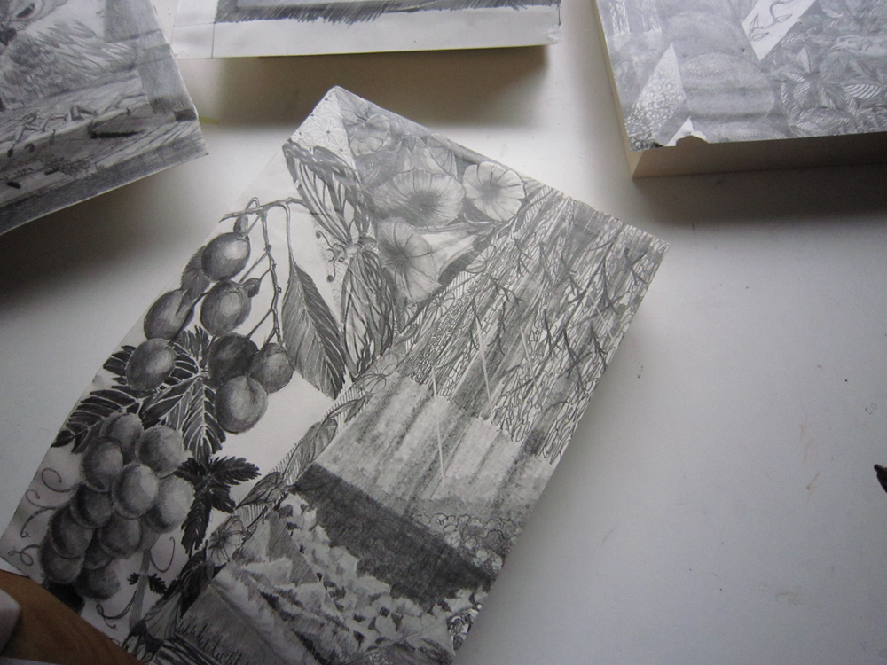
UPS brought me a huge box the other day. Inside, under an enormous amount of styrofoam peanuts, were a couple of intricate graphite drawings by one of my first art teachers, Vic Thomas, in two 24 x 28 inch metal frames.

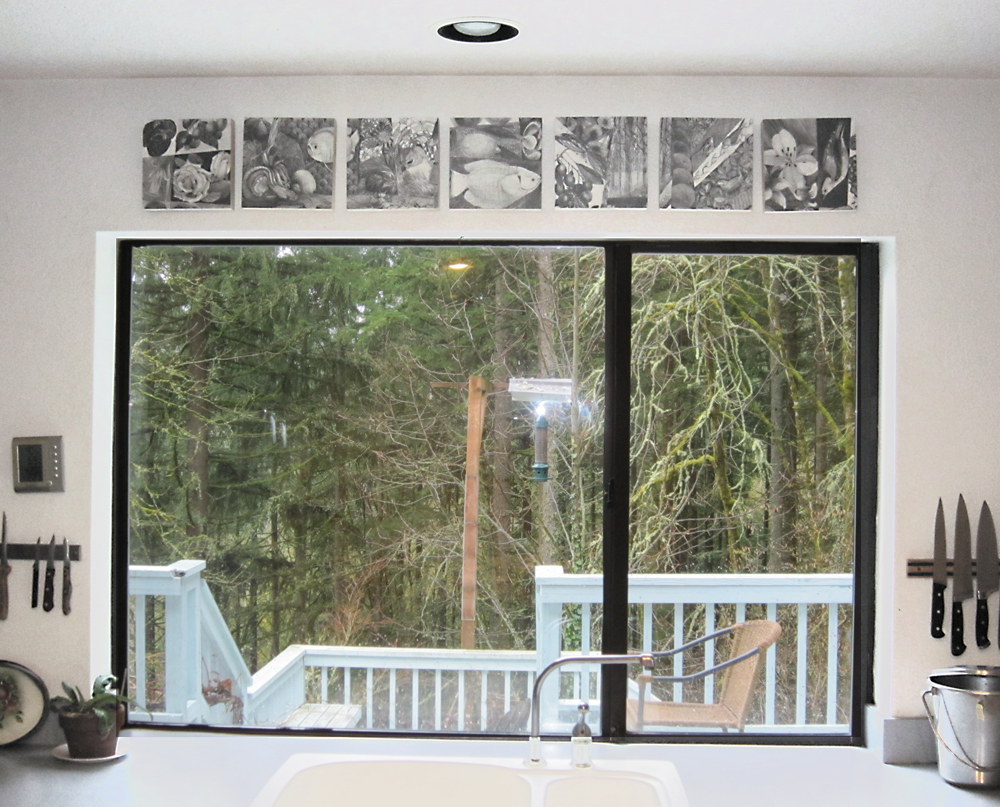
The art is delightful and I wanted to place it appropriately! But with two artists and many windows all competing for wall space, I pondered the possibilities for displaying this gift. The solution is to mount the art on 8-inch square cradle boards, and hang horizontally above my kitchen window.

Since the art was designed by dividing the space into many smaller areas, it is not too difficult to divide it.  I did have to split one of the fish images in half, but since the panels hang one inch apart it still works cohesively. The hardest part is removing the thin paper from the foam core but I manage that with only a tiny bit of tearing.

I’m using birch cradles, made by American Easel in Salem Oregon.
www.americaneasel.com
You can buy them in Portland at Art Media.
www.artmediaonline.com

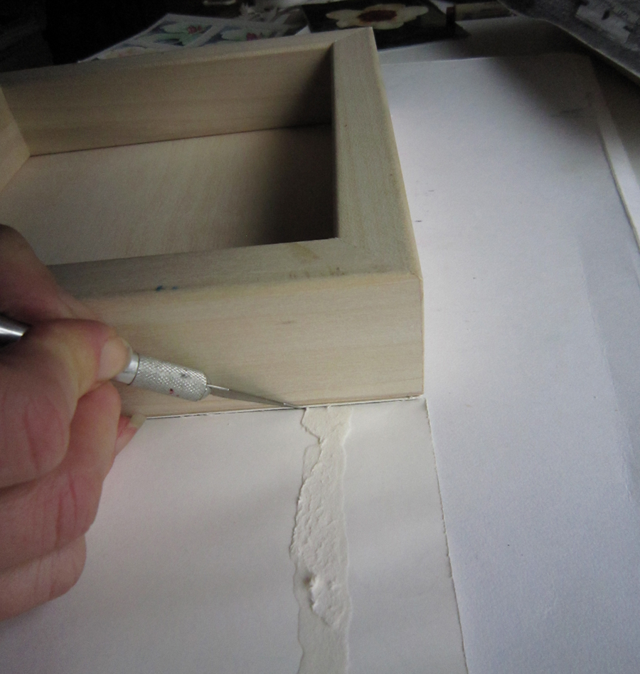
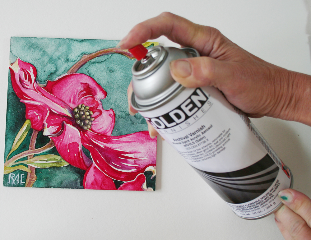
I prepare the art and cradles using Golden products that protect it as I work, seal the acid in the wood and add a finish to protect from ultraviolet light. I’m trimming excess paper, above, and sanding a rough edge, below.

  A layer of Top Coat — looks like Elmers glue when wet but dries perfectly transparent!

Then attach wire hangers and wall hooks…

 Here they are above my kitchen window where we watch the birds feeding… I LOVE how it turned out! Vic, I hope you approve.

Aquabord, if you haven’t tried it for watercolor, works a little differently than any other surface. Water absorbs into the clay while the pigment floats on top, allowing for granulating patterns and lifting of paint. The clay turns buff colored when wet and dries back to white. The sculpted surface encourages pigment to granulate. Layering builds up rich color values.

Varnishing the work when finished brings out the vibrant color of wet paint! And after varnishing there’s no need to hide your beautiful art behind glass.

I accidentally left a painting outside overnight (letting the varnish fumes evaporate) and found it drenched with rainwater!

No worry, just shake it off and wipe dry.

I’ll be over at the downtown Art Media store from 2 to 4 pm on Wednesday, February 16th, to demonstrate using watercolor on Aquabord (pictured here with Art Media’s lovely Gail Vines).

I will talk about using watercolor paper on beautiful, locally manufactured, birch Cradle Boards. This is a technique I’m experimenting with that is new to the watercolor community. Again, I frame without glass — this time using a top coat of acrylic for complete protection of the paper surface.

OK, I’ll also be shamelessly promoting my upcoming workshops!

Join me there… It’s free, and with a $20 purchase you can park free, across the street at the Smart Park, garage entrance on 10th.

Art Media (downtown)
902 SW Yamhill
Portland, OR 97205
Phone: 503.223.3724
1.800.990.3364

A week of exploration yielded paintings based on an image that Myrna provided, plus I used reference of the same person, (Mike Henderson — an art instructor, painter and blues musician), captured from on an online video. My goal was to work in different styles, using materials both new and familiar. Value study sketches were used to become familiar with the subject.

A quick sketch with a marker on Strathmore wet media board, was over-painted with a mix of mat media, gesso and Golden’s Absorbent Ground, adding a bit of texture when wet. Then I added watercolor washes of Quinacridone Violet, Phthalocyanine Green, and Vermillion. Used printer stamps to add the letters.

This, on Crescent Watercolor Board, uses India Ink and watercolor washes. I added Golden Crackle Paste painted (when dry) with watercolor and Winsor Newton’s Iridescent Medium.

Sketch was warped in Adobe Photoshop, I then outlined it in resist using a metal tipped squirt bottle. It eventually clogged the tip! Resist was removed after painting to reveal white lines.


This was painted on a background of watercolor on Yupo paper. Since it is not paper at all, but plastic, the paint sits on the surface and is easily removed. I used an angular motif to sketch on the face, then lifted areas to white or pale tones. More darks were added to block in shadows.


Working from one of my image captures, this piece is an attempt to add a feeling of antiquity. I added a halo of gold leaf, and wings! In blue and gold. It’s on an old piece of paper I added mat medium and gesso with paint mixed in, a thin layer of absorbent ground mutes the color and allows for paint to adhere.

This is my personal favorite. 3/4 view. I’m working on Strathmore board again. It is a looser, sketchy rendering, using M.Graham’s Purple Dioxazine paint to block in values and DaVinci Watercolor Encausticks — a new product I have been testing — to add gradations and details.
Use the large “crayons” dry, then soften with water, or dip in water and draw, or draw on wet paper — all for different effects. I’ll call this “I Want To Be Like Mike!”

Golden liquid acrylic, squeezed right from the bottle on a watercolor block outlines this high key image. It is a stylized piece, drawing from the work of Alphonse Mucha for inspiration. Wet watercolor mostly stays within the acrylic lines.