It is always a treat to participate in the WSO conventions, twice a year, where many artists from around the state and beyond, gather to learn (or teach). Each time it is at a different location around the state, and this one was at the Hilton in Eugene.
I’ve been a member about 10 years, and it didn’t take long to develop a comradery.
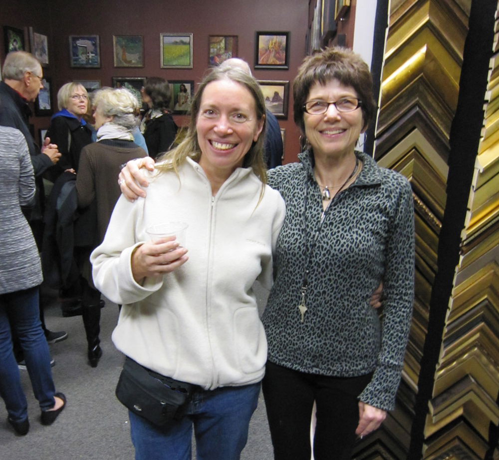
Here is Jane Ferlitsch and Shelly Wiersba posing in front of the sculptural wall on their way to the gallery next door.

I took in a lecture by Judy Morris and a demo by Judy Hoiness. Judy is explaining textural effects she gets using water soluble crayons.

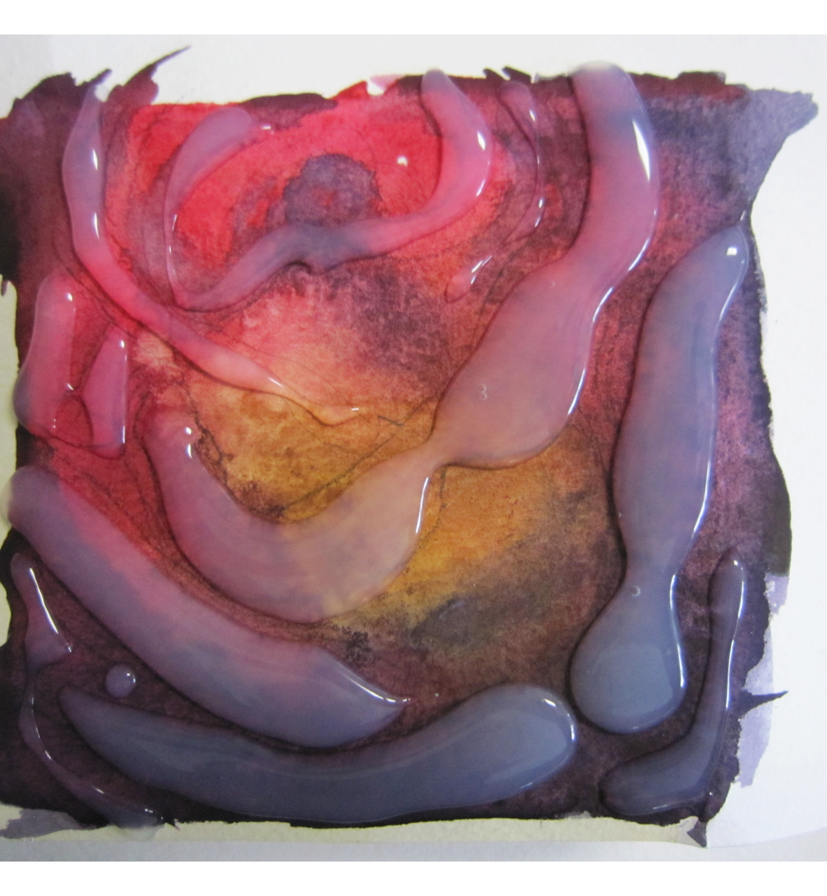
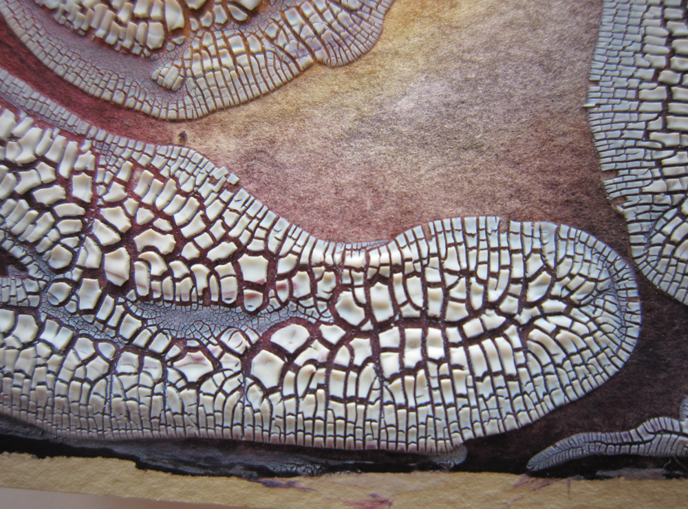
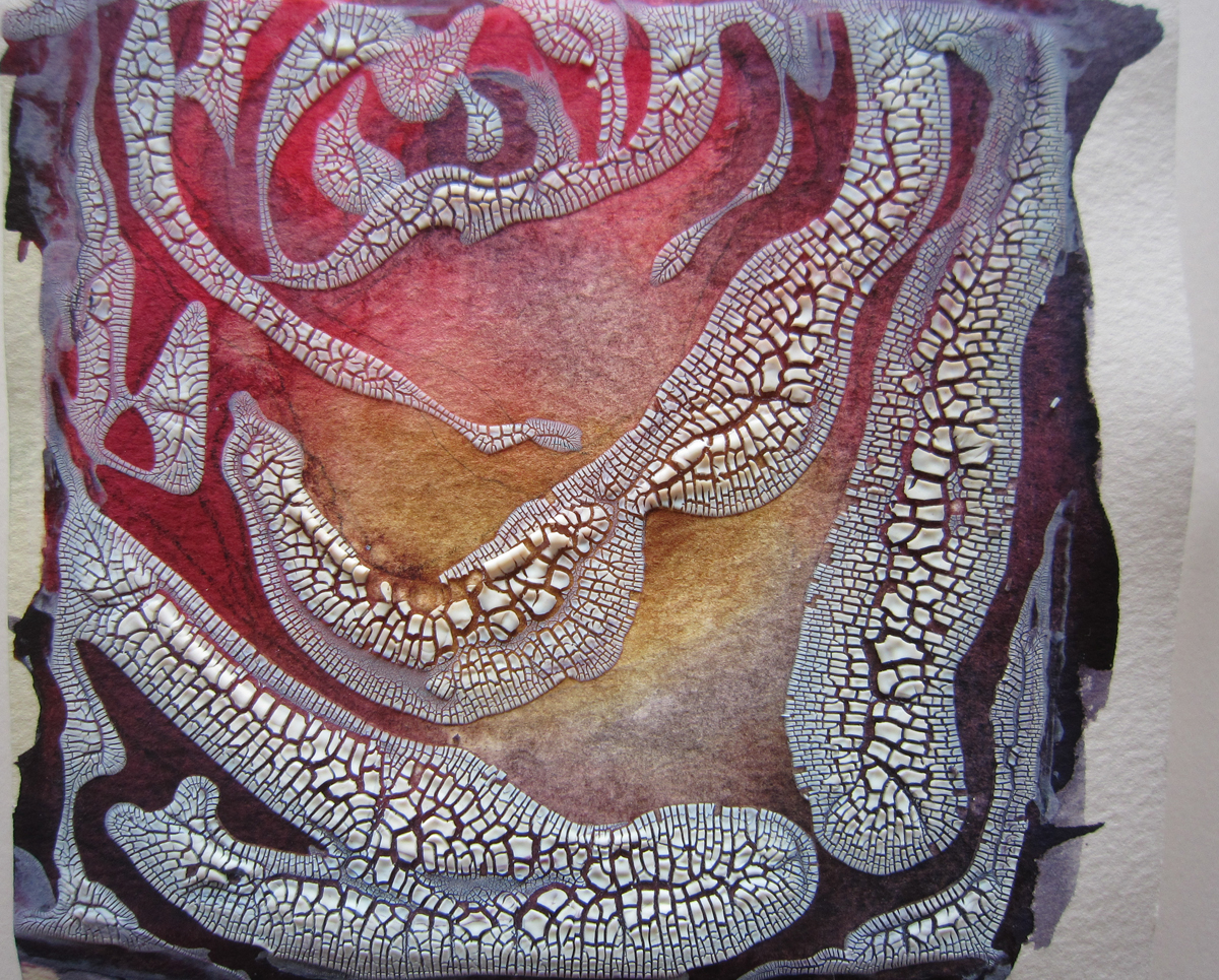
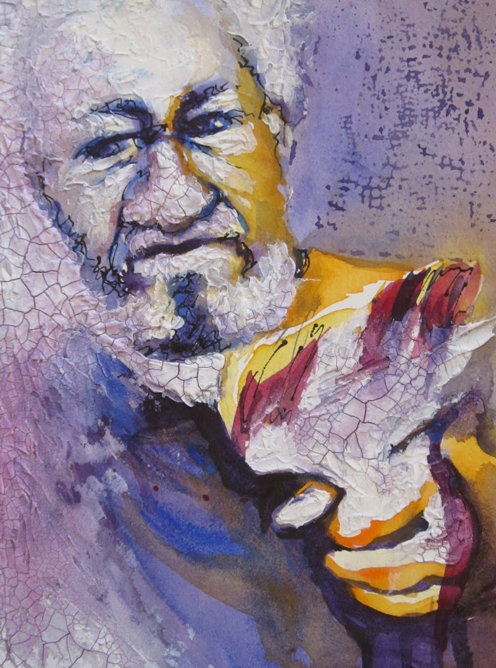
Our juror, Betsy Dillard Stroud, critiqued slides of our artwork and gave a demonstration on Sunday. Here is her demo piece, held by Venita Pampas (who won an award for her painting that conveyed a depth of feeling) for photographing. It was purchased by one of our WSO members.


Notice Betsy’s “signature” script that is in reality a form of scribbled texture. We watched her crank this out in about an hour using stamps and acrylic paint. It is both complex and elegant.
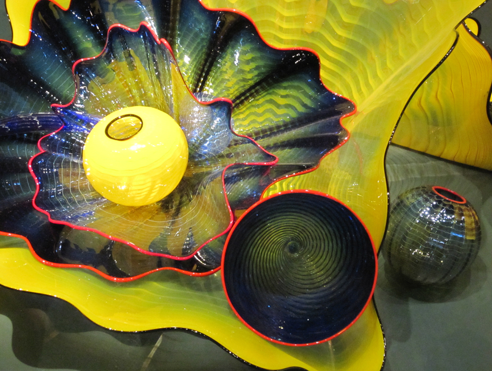
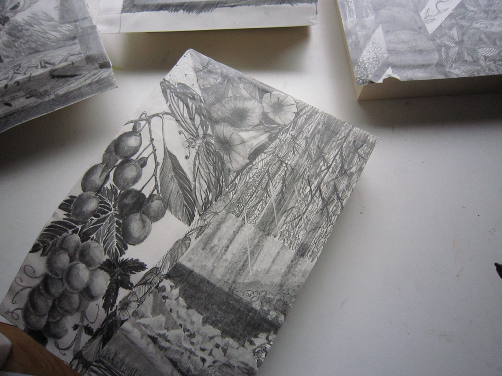
By the end of the Convention it feels like someone opened up my head and poured it full! So I take lots of notes to digest later. And eye candy from the show inspires me to see illustration possibilities in everything I see around me!
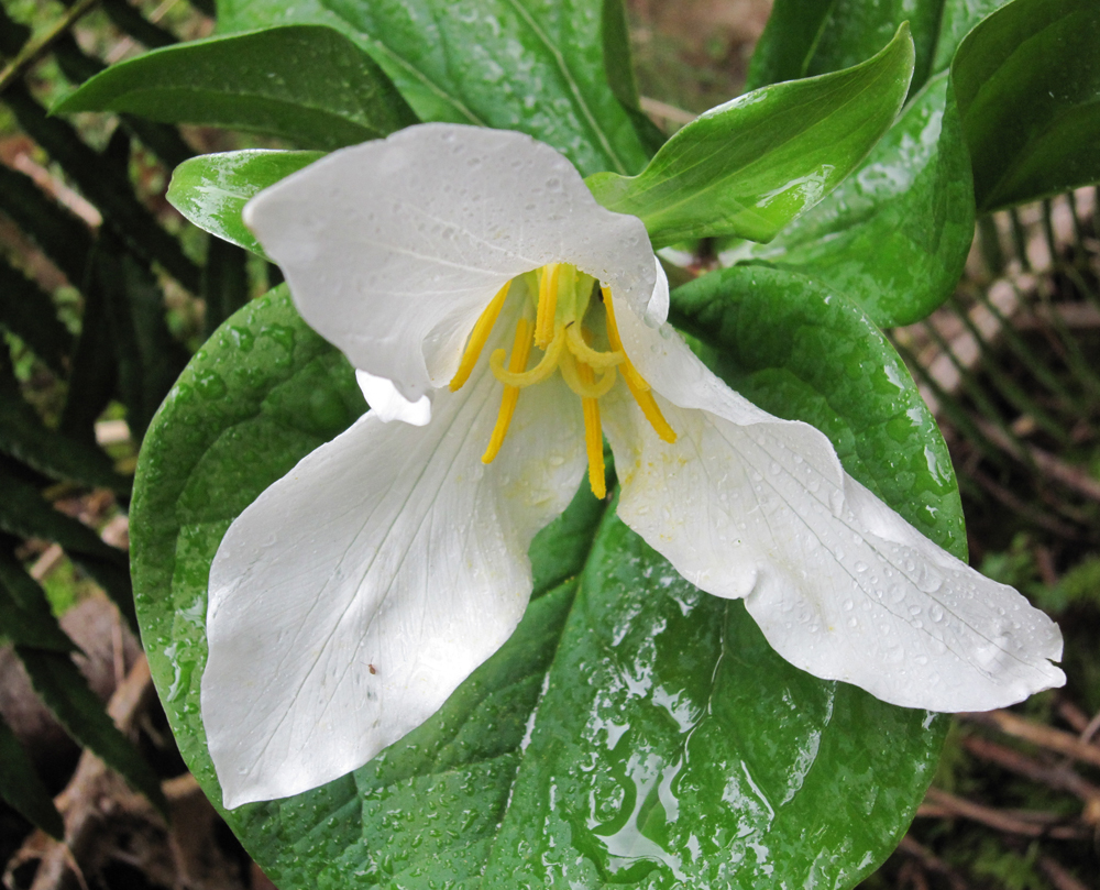
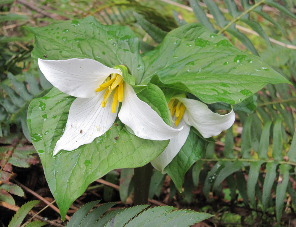
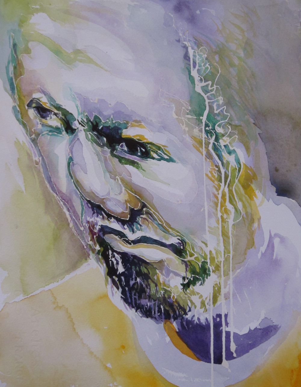
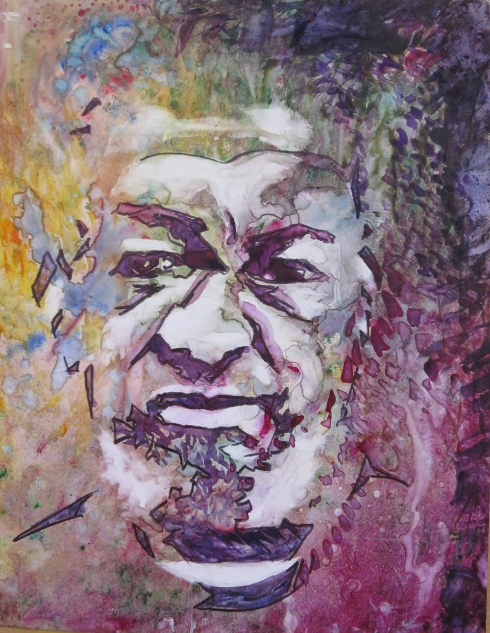
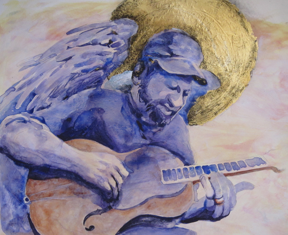
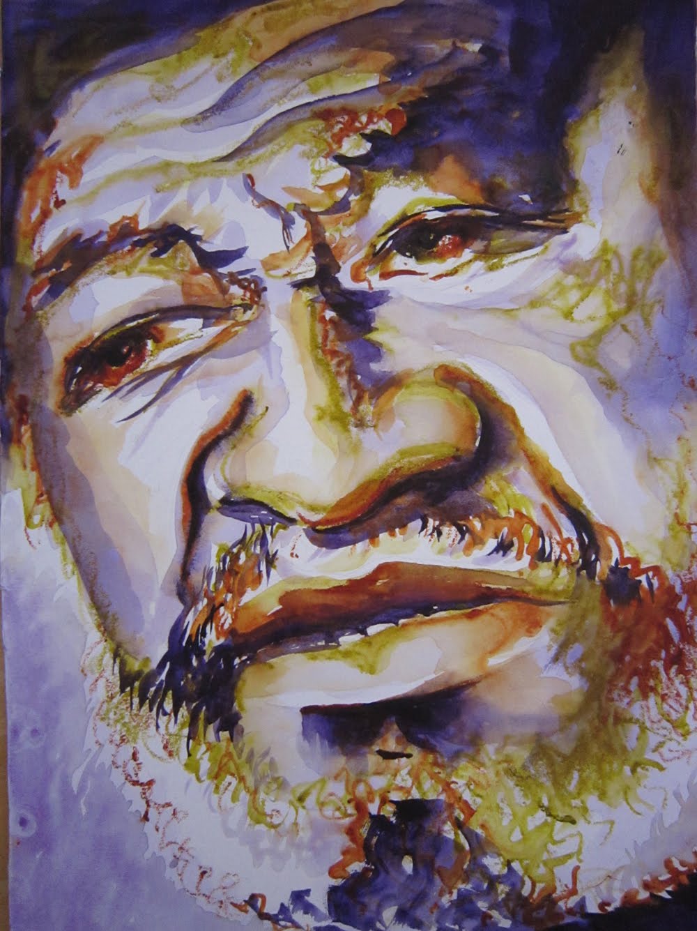
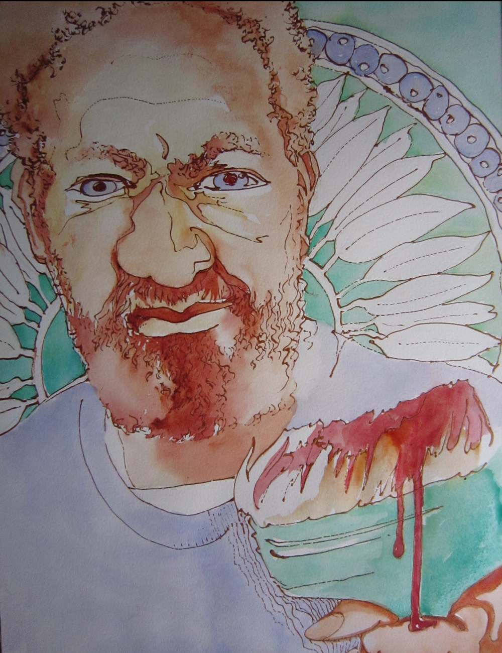
Here are a couple of images I may use someday as reference for future work…

Sharon posing for us in a phone booth with reflections in glass, above and below, an eatery at 5th Street Market.


