JUNE 3-day PORTRAIT WORKSHOP in Hood River
I am preparing now to teach an Oregon workshop focused on portraits later this month in the Columbia Arts Center right in Hood River’s charming downtown. It takes only about an hour to get to Hood River from downtown Portland. MORE INFORMATION about the workshop
DATES: June 19-21
COST: $285
HOURS: 9am – 4pm
Basic painting skills are helpful, but all levels are welcome
I believe there are still spaces available. You can REGISTER ONLINE
or contact COLUMBIA CENTER FOR THE ARTS to sign up directly
I LIKE MY LIFE!
The first half of May I traveled in France to begin to formulate a workshop there for 2016. Laura Shea, Janet Parker, Mary Lee Damutz and I had an incredible time exploring the possibilities there. I will let you know the details when they’re set.
The second half of May I taught a workshop in Tuscany and I can’t wait to tell you more about it! Look for my next post, including work from this event.
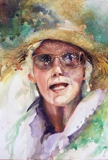
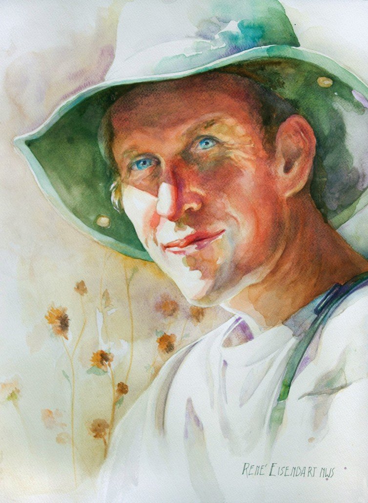
Here is a portrait I started in a demo for the Portland group Buffalo Grass and finished in the Tuscany workshop, from a photo taken last year in Italy. This work is of an artist, Marj Pucchi, who taught art in the states and retired with her husband to his family home in the hills above Lucca. She is quite a charmer, both in personality and image!
ART ISN’T MAGIC, it’s Planning!
Often that time spent with the initial planning determines the success of your painting! While this workshop covers all aspects of portrait painting, an exceptional work is very much dependent on design. Learn how to set yourself up for success with your portraits.
STEP BY STEP, a new portrait
I began this as a demo in my 3-day workshop in Vancouver last April.
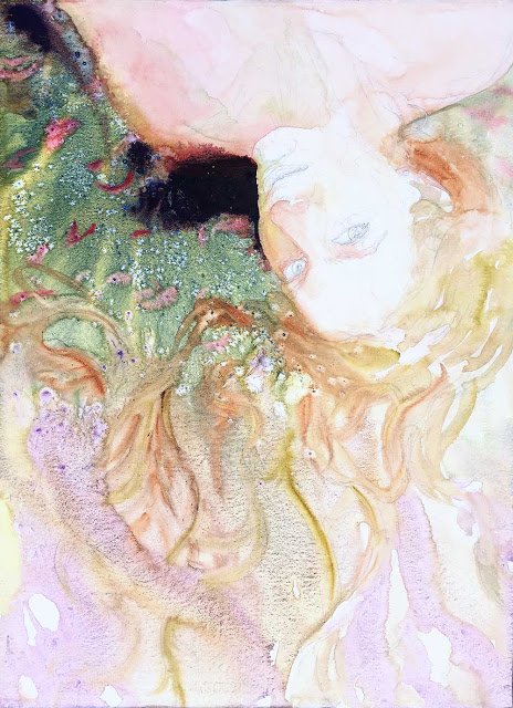
Here’s what the first pour looked like:
I’m liking how this begins! I’ve barely started laying in flesh tones when I take off with a pour.
Then with a brush I paint in the small red flowers using M.Graham’s Quinacridone Red — one of my favorite pigments (PR209). Daniel Smith calls it Quinacridone Coral. It’s confusing how different manufacturers use their own names for identical pigments! To know what you’re using you have to check the pigment numbers.
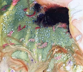
Notice the dark area — it overpowers the painting at this point but I know I’ll be adding other darks to balance it. And I’ve used my black mix which is quite liftable should I want to lighten it later on.
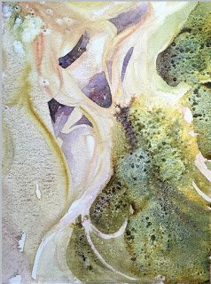
Below a detail of the pour:
To simulate moss, I’ve used a Daniel Smith paint Undersea Green which is essentially a mix of Ultramarine Blue and Quinacridone Gold (PB29 & PO49). Seeing two pigment numbers on a tube tells you it is a “convenience blend.”
D.Smith is a master of marketing and packaging, but the quality of their product is good. But I prefer the consistency of M.Graham. When I use DS paint I normally mix it up with water in a small squirt bottle because I don’t like that it dries out on my palette. If you don’t want to buy an extra tube of paint, just mix your own using M.Graham and you’ll find it pretty much works the same way. This mix works well with salt.
Here are two more details.
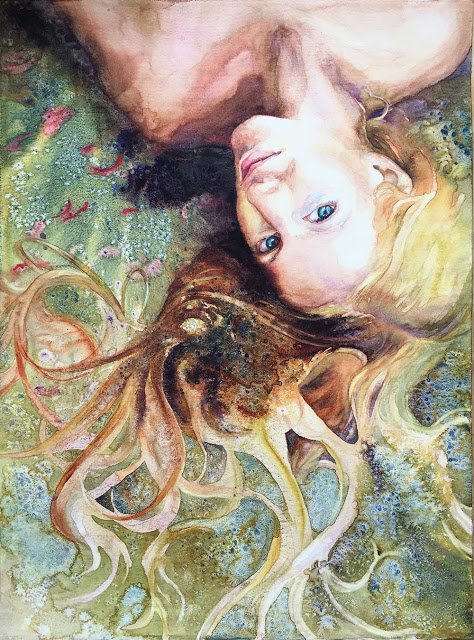
I’ve layered in darker areas of paint in the hair. Notice I’ve also done a bit of lifting.
I’ve added more detail to the hair, working in the appropriate values. And I still plan to integrate the edge between body and background. But my aim is to complete this without destroying all the freshness created by the paint pours!

