WINNING TECHNIQUE  

After winning 2nd place at NWWS, “Eating Crow” was my first acceptance in the American Watercolor Society’s show in New York, in 2019. 

Follow the link above for the back story.

An artist asked, regarding my painting “Eating Crow”

…Could you tell me what paper and pigments you used?

                        So here’s my answer:

PAPER

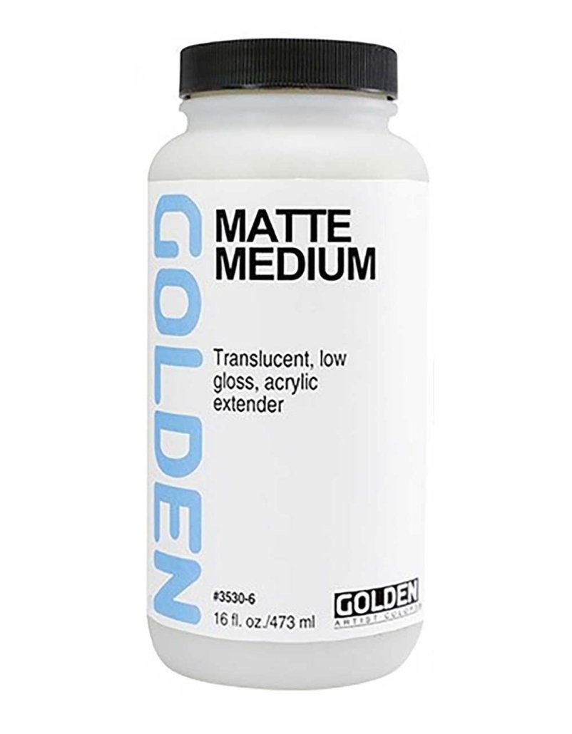
     I used a full sheet of Fabriano Artistico 300#, which has a surface that is quite absorbent. All watercolor paper has size added to keep the paint from absorbing too much. Some just are still more absorbent than is useful for my taste. To counter that, I applied a coat of matte medium mixed with water.
     The matte medium can be applied either before or after you sketch with pencil, but keep in mind that coating second you won’t be able to erase at all, and pencil on treated paper is more difficult to erase (it can smear).
     The other difference with painting on treated paper is that paint tends to lift easier, maybe not all the way back to white, but like when working on yupo, if you brush back over dry paint, it will lift. So, adding paint can be a dance… It has taught me to paint with intention instead of fussing. To put the paint down, wait for it to dry, and then modify if needed. It helps to work wet, with a soft brush. Or sometimes I edit the paint with a barely wet brush. You’ll find what works for you.
    When I work without treating the paper I usually use Arches Aquarelle, either 300# or 140#.

TREATING WITH MATTE MEDIUM

     Change the way paint interacts with your watercolor paper by adding a coating of half matte medium and half water. This surface encourages texture and lifting.

HERE IS HOW

In another container, dilute the matte medium with water 50/50, mix well and brush it onto your watercolor paper with a thin 1 to 2 inch acrylic brush, (not your expensive watercolor brushes). Make sure you cover every bit of the surface. Try brushing one direction, then when it is still wet brush a second time the other direction. Look in the light for reflection — if there are no gaps in the shine, you’re golden. Touch up if needed. Then let it dry completely before you paint.

One note: Sometimes you’ll see brush strokes on the surface of your paper when you begin to apply watercolor paint. If you don’t like this look, try diluting with more water and applying a second coat after the first coat is dry. Or use random strokes instead of even ones, to create a texture with interest.

THE PALETTE

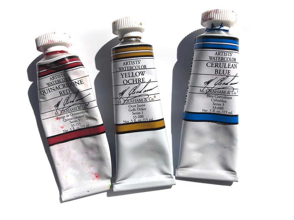
 I use only M.Graham paints, as they stay dampish in the palette. Be sure to let your freshly squeezed wet tube paint dry for a week or so before closing up a sealed palette, though. And I prefer how the paint works when it is slightly dried over fresh squeezed — it will still reconstitute easily.
     For pigments… I use a fairly limited palette.
I don’t use grey or black prepared mixes, preferring to make my own.

RENE’s BLACK MIX:
4 parts ultramarine blue
2 parts alizarin crimson (either permanent, regular or 1 part of each)
(less than) 1 part gamboge
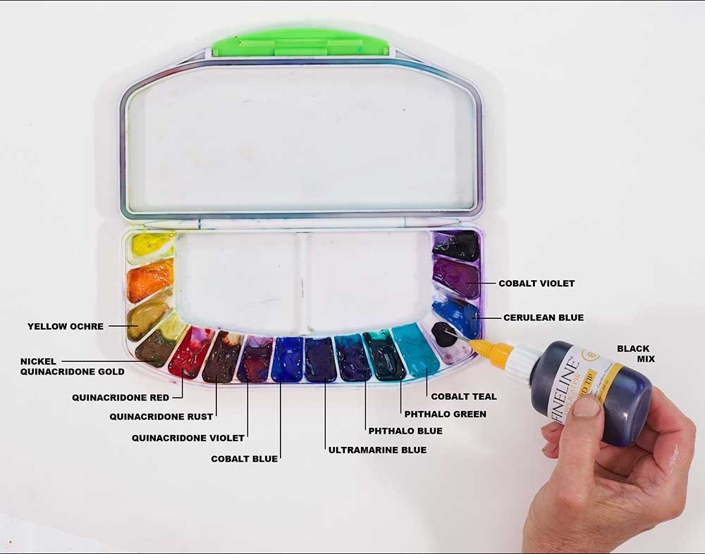
This makes a purplish dark, that I mix with other colors to get the neutral tones I need. I keep it in a fineliner bottle (the kind with the wire in the cap) along with enough distilled water to make a thick slurry, then add it to the palette as needed.
      For grays I love to use the “slop” in my palette, adding whatever pigment is needed to get the shade I want. This mixing is a great practice, as it teaches color nuance better than anything.

      Flesh tones are mixed from Quinacridone red (which is pretty much my go-to red for everything), Yellow ochre with a bit of Cerulean blue. For darker tones, use more blue, or Ultramarine blue or add some of the black mix above. I often use Cobalt Violet as an accent color on flesh and see that I did here.
       Besides that, I’m using quinacridone gold… I mix my greens from quinacridone gold and phthalo green with a bit of quinacridone rust to make olive tones or add quinacridone violet to make grey greens. I see a bit of phthalo blue and probably a little cobalt here and there.

This is my travel palette. My palettes pretty much NEVER look this clean! I save the beautiful muck because it makes the BEST neutrals. Add a bit of whatever color will nudge it to the desired shade.

PAINT APPLICATION

        To get the texture, work VERY wet… dropping water into the paint. Let it puddle and dry without sopping it up (resist the urge). You can redirect the flow by changing the level of the paper so the water runs where you want it to… it will (usually) stay within the wet areas. This adds the necessary serendipity. I could write three blog posts on paint application technique, so I’ll stop here!
        Then after the painting is finished I seal with acrylic. This process is easier with paper that is treated with matte medium 🙂