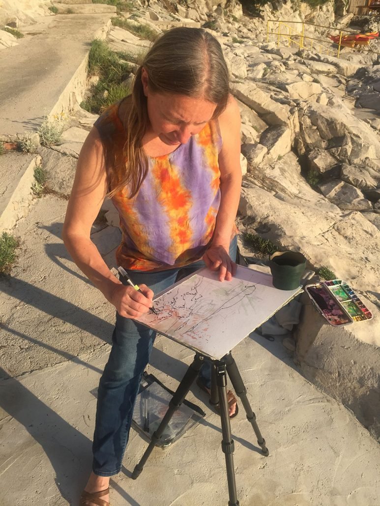
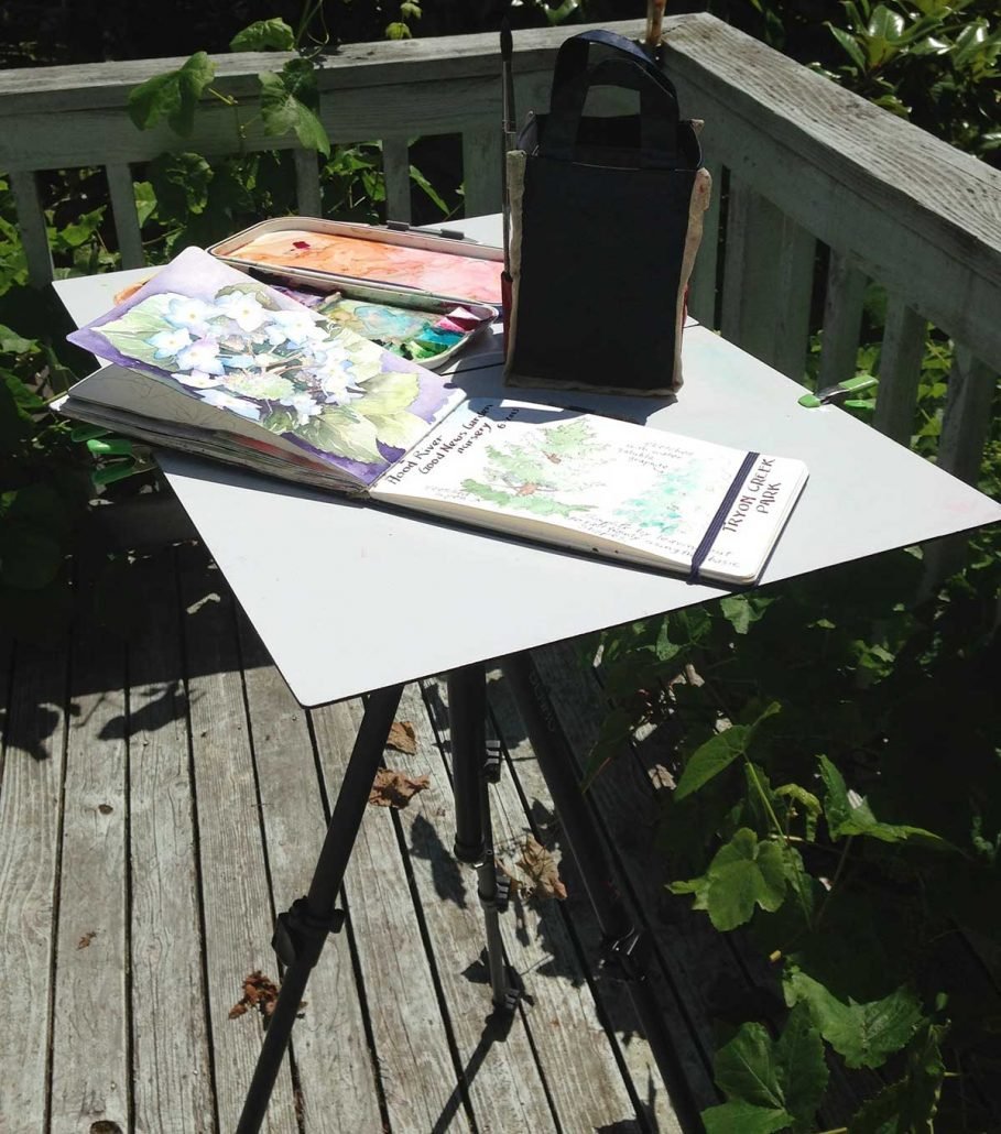
Outside a foot of ice is melting into rain — a good time to think about warm days ahead! I’m starting to pack for Hawaii while also preparing to meet with my Croatia group on Monday. I always take my painting easel on the go.
When you’re traveling around or painting plein air, it’s handy to have a light-weight easel that folds down compact and sets up easily. While there are many types you can purchase ready to use, I decided to design and make my own. I wanted one that’s more portable than any I could find. I built this easel several years ago and have traveled with it to Hawaii, France and Italy, plus I use it for teaching throughout the region. Here I am sketching in Croatia!
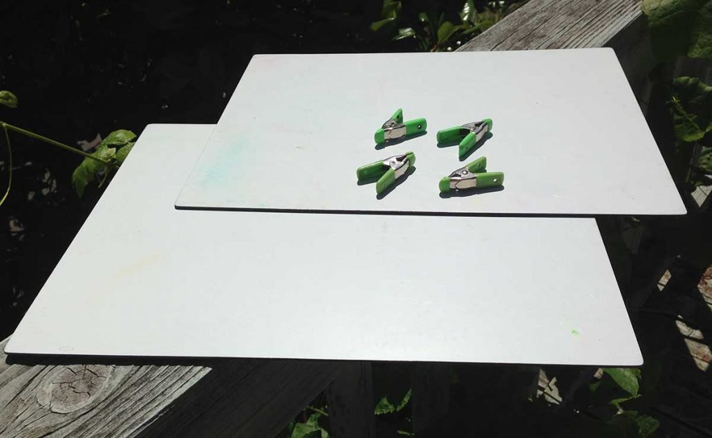
To make one, you will need:
Dibond — for table surface
Spare camera mounting plate (if you want to keep the original plate for your camera)
Two tiny bolts with washers and nuts
Gatorbord – 1/4 inch
Hardware clips
Strong but light weight tripod with ball head —
I started out using a BENRO aluminum tripod which is really quick to adjust, along with my MANFROTTO ball head that uses a quick release mounting plate.
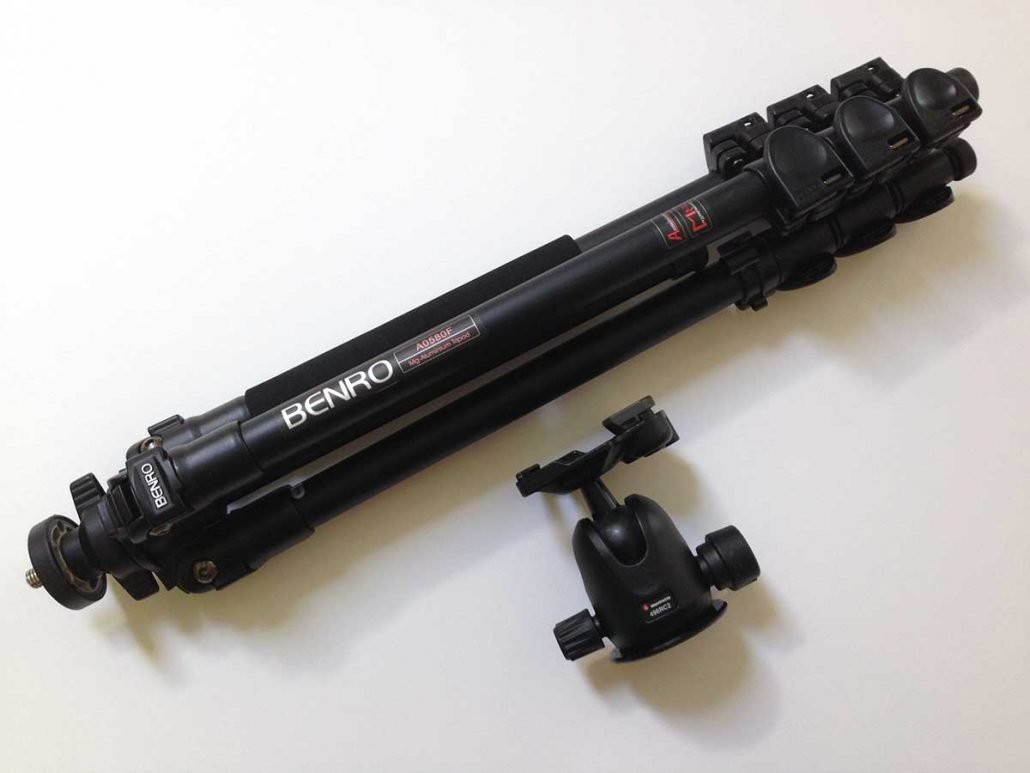
Now I often travel with a DIC & MIC tripod instead. Made of carbon fiber, it is even lighter weight than the Benro and collapses to a smaller size for packing. The screw extension system isn’t quite as quick as Benro’s clips for adjusting the legs but the extra portability is worth it. Available from AliExpress for just $109, this knock-off is quite comparable in quality to way more expensive brand name tripods. And it comes with a ball head that could work almost as well as the Manfrotto. The camera mounting PLATE for DIC & MIC may be a bit trickier to place and remove from the head each time but being thicker than the manfrotto PLATE it may be easier to attach to the Dibond. Since my plate fits the Manfrotto head, I still use that one and just swapped out the tripod legs.
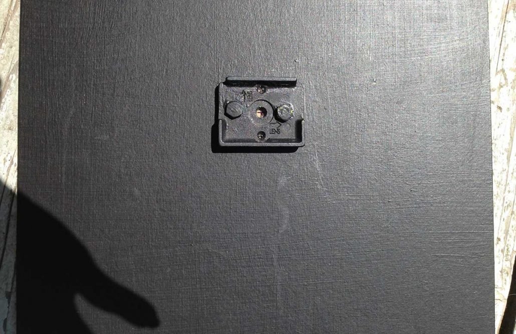
Dibond —Aluminum Face/Polyethylene Core Panel — the material I recommend using for the plate
It is not plexiglass. Dibond is a thin sheet of acrylic sandwiched between two very thin sheets of aluminum, which makes it quite strong for the weight.
It comes in different colors, white is the most economical. I believe it may be slightly thicker in width than the stuff I used — mine is actually an older scrap piece that’s less than an eighth-inch thick that I bought from Multi-Craft Plastics. It is a bit larger than a quarter sheet of watercolor paper. For a larger surface I attach a sheet of 1/4 inch gatorboard using hardware clips. More width would actually make construction easier, with less grinding required.
Multi-Craft Plastics
7298 SW Tech Center Dr
Tigard
(503) 352-0970
Assembly is pretty easy if you have some power tools and a handy man! Basically, you just bolt a camera mounting plate onto a sheet of Dibond. My husband Tom did the drilling & grinding.
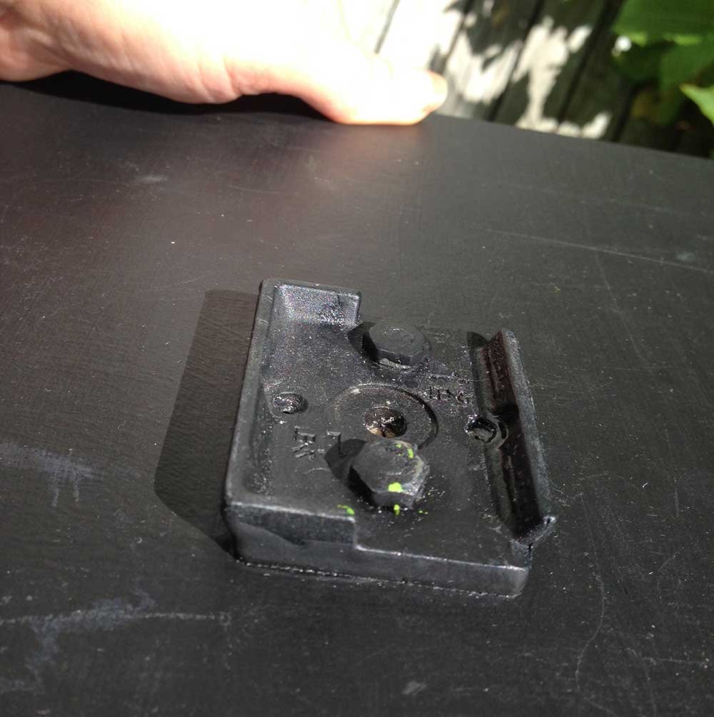
Holes were drilled in the Dibond, wedge shaped at the top, so the bolts will counter sink into the Dibond plate. Tom then drilled two holes in the camera plate, one on either side of the center hole. He modified a couple of small, phillips, flat head bolts to fit, cutting off the ends of the bolts (after inserting). He also ground down the flat “head” ends of the bolts so they would fit flush when placed in the holes.

He ground the nuts down to be thin enough to fit flush inside the recess of the plate. Then I painted the hardware with black acrylic paint.
Ideal for painting plein air, this painting easel has already given me years of use! I’ve never seen one I like better.
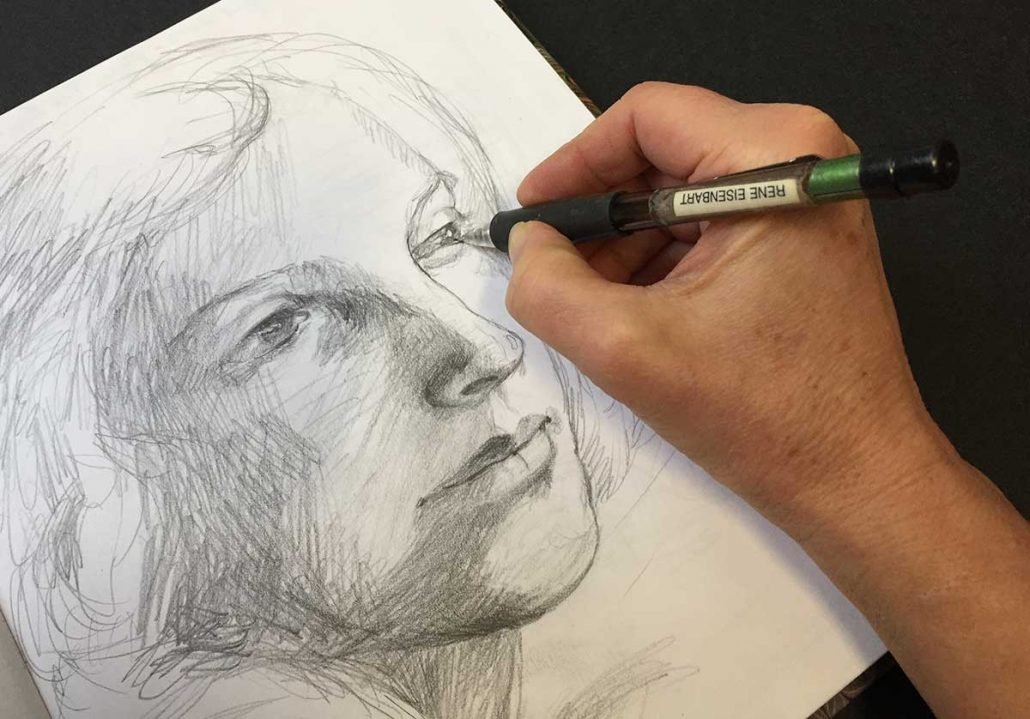
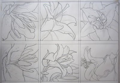
While it may come more easily for some than others, drawing is something to form a habit of. The benefit is in the doing! Drawing is a learned skill, and just like swimming or playing the violin, the more you do it the more comfortable you’ll be.
Beginning artists either feel like they have a latent ability for art — or they don’t. It’s really fun to watch someone who has absolutely no idea they can draw, discover that they have an aptitude for it. That happened with my friend Mary McCarty, who is phenomenal! Here’s one of her drawings with just minimal color. Others have no color. See more of her work HERE.

That is not to say that drawing will come easily for you — sometimes it does and sometimes it does not. But you can count on this: If you give yourself permission to work with it — to actually spend time doing it — you will improve. It’s best starting out if you simply let go of the idea of being “good” or having “good” drawings and work on being expressive. Just draw for yourself. Sometimes working on accuracy can be useful, but the main thing is to find a way to enjoy the meditative process of drawing, so you will continue to want to do it.
In a Creative Catalyst film, PATTERN & FORM: Advanced Collage Techniques, Anne Bagby recommends drawing 15 minutes every day.
I had always thought of drawing as being a “drawn out”, time consuming process! My goal had been either to make complete, intricate drawings as a way of better understanding my subject or to make simple outlines as painting guides or when working through design issues.
The idea of quick, expressive sketches appeals to me. Just like with any exercise, the discipline of regular, short intervals makes a huge difference in comfort level with drawing. Try it! Not having time is no excuse when it only takes 15 minutes of your day. To develop the habit, set a time that you can devote each day. And stick to it!
One other thing…
If drawing isn’t the place where you naturally excel, don’t worry! You will discover other areas where your talents will sing. It could be your sense of color or design, or even a pattern of discipline or tenacity. It could be something else. But give yourself lots of space to explore your own unique creative abilities.
…………..
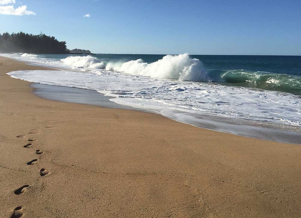
I’ve been enjoying the snow we’ve had this year… but hey, enough is enough! Fortunately it will soon be time to head to Hawaii and get a sun fix at our Kauai Retreat, February 3-15. Getting off the plane the tropical air envelopes you! Before leaving the airport, slip on a pair of shorts and flip flops. OK, I admit it’s a work trip for me and there is plenty of prep to be done before the others arrive. So why the nonstop smile? Soon there’ll be time to walk the beaches and paint the local color.
Join us!
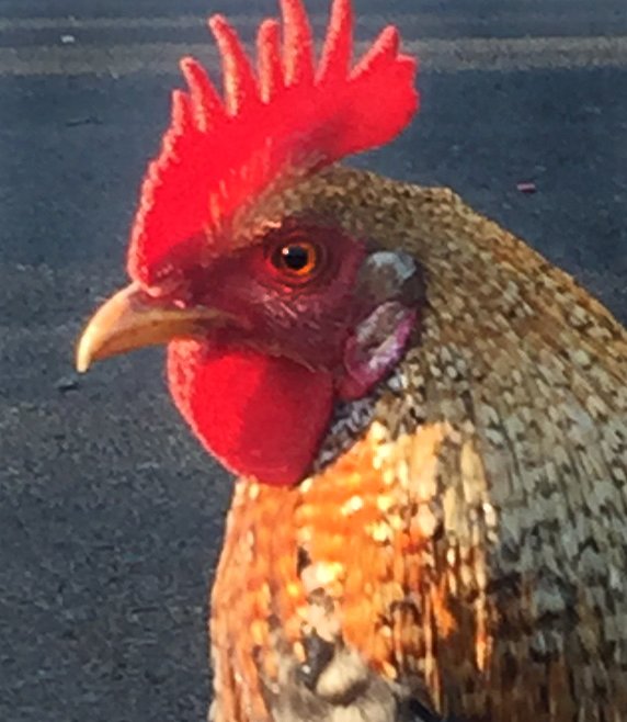
Definitely we’ll paint a rooster — it’s Kauai after all!
Here’s where we’ll be staying… a new place this year, in Princeville. Check out the open floor plan and lush grounds.

Cocktails — Mango Pie — Beach combing — Snorkeling — Whatever strikes your fancy!
Fertile valleys producing exotic fruits sold at colorful farmers markets.
Check out other blog posts about Hawaii…
Details & Sign up… HERE
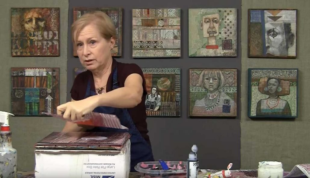
When it comes to growing as an artist, I have an unfair advantage — I teach
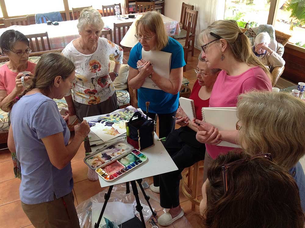
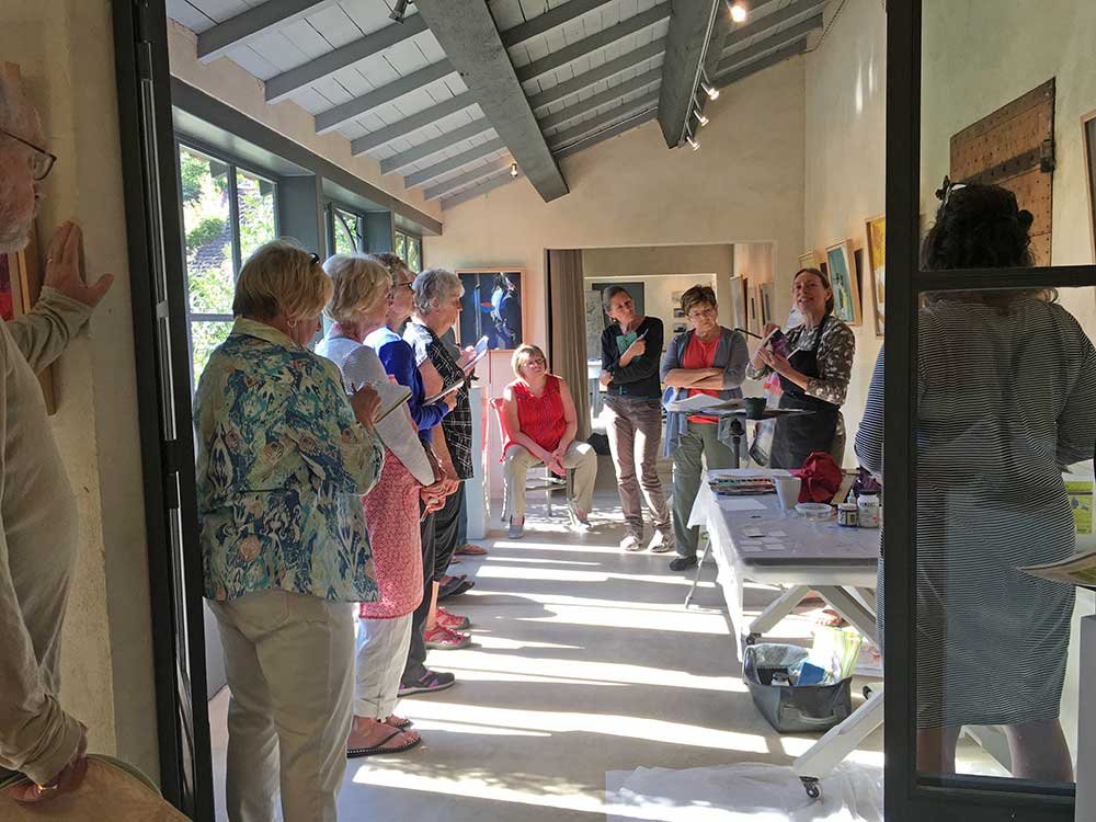
Teaching in Hawaii
Some years ago, I noticed that many of the very successful artists who come to Oregon to jury and speak at Watercolor Society of Oregon (WSO) conventions are also very good teachers. I believe this is no coincidence. Teaching keeps us continually pushing the edges of learning. We HAVE to! It is part of the job requirement. It is essential to find a way to articulate how we do what we do. First we have to really understand our process, step-by-step. Teaching forces us to focus on the details! Of course, it’s also just plain fun to share what we know.
Between teaching, painting, shows, contests and having a life, my calendar is full! Sometimes I’m asked, “how do you ever find time to paint?” In truth it is the teaching, along with our vibrant artist community, that stimulates me. I learn so much from my students and colleagues through osmosis. I’m continually being introduced to new products, interesting techniques or another aesthetic concept. Traveling to teach is an added plus!
Teaching in Saint Remy, France
Teaching gives us permission to paint. Maybe you’ve found another way to give that to yourself — taking a class or joining a group to find incentive. Let’s face it — life offers oh, so many distractions! If we haven’t made a commitment to painting, likely we will not do it — regardless of how rewarding it is when we do paint.
There are plenty of accomplished artists who don’t teach, or don’t teach well 🙂 so it’s not an essential component. But if you’re one who is inclined, I encourage you to share what you know as an opportunity for growth!
LEARNING
One parting thought… if you live in Oregon and you’re not already a WSO member, you’re missing the best opportunity for art community and low cost learning that I know of. I’ve been going to the conventions for years, soaking up ideas and inspiration from our esteemed jurors as well as breakout sessions by some of the best local teaching talent in the state. Plus, the twice yearly conventions are just a hoot! The corresponding spring and fall workshops taught by the juror offers studying with nationally respected instructors at an affordable price.
MEMBERSHIP — Check it out… you can apply for WSO Associate membership any time, regardless of where you live. The annual Full membership application is in the fall — just submit three digital images of your work.
OUR NEXT WSO CONVENTION will be April 7, 8 &9 in Eugene.
I’ll be leading a breakout session on marbling with Liz Walker
The show will be held at the Jordan Schnitzer Museum! Don’t miss it.

My collage portrait was awarded 1st place at Oregon Society of Artist’s 200 for under $200 show by juror Paul Trapp, along with a very generous prize. It is such a fine honor, as the gallery is filled with beautiful artwork! Some of it no doubt took many loving hours to make. With a different juror or perhaps even on a different day, the prize could have gone to one of them.
I had planned to enter the painting, “Blue Fresco” read about it here — and since it sold before the show started, I got to work on a new painting — actually two of them. First I used a watercolor portrait study to mount on a wood cradled panel by American Easel, then added both Golden crackle paste and sheetrock mud to obscure it. Here it is, clearly unfinished.
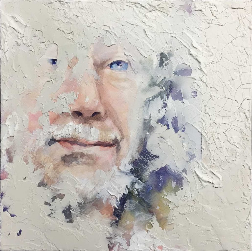
But not seeing where to take it from here, I shifted gears with another idea… a collage painting.
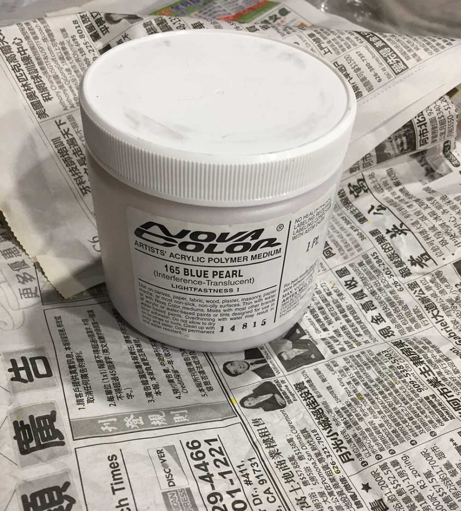
A large order had just come in from Nova Color. They don’t advertise and you won’t find it in art stores… If you don’t already know about Nova, they sell very high quality acrylic paint and mediums at very reasonable prices.
The padding inside the box happened to be Chinese newspaper — neutral grey patterning — a perfect background for a collage. Here’s a very basic thing about collage: If your subject has strong value shapes it is far more interesting. And neighboring neutrals really make color pop! Collage can often look funny, and that gets noticed. Most of the time when we paint portraits we work very hard to make them look normal, while it is the unique that draws attention.
Here’s a section from a large, painted portrait…
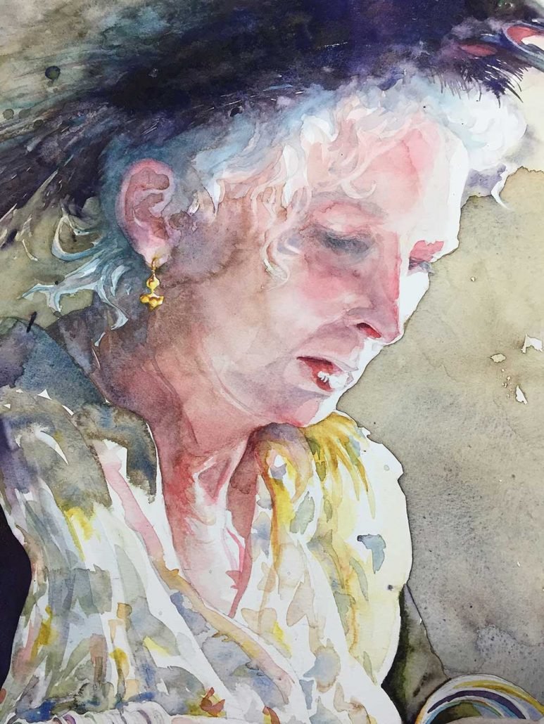
… that I made from a photo I took of Mary on hat day at Menucha, with light across the edge of her face. It has rich color and shadows.

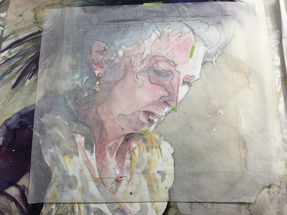
Since I’d already interpreted the image and it was the right size for my 12 x 12 panel, I simply put a layer of tracing paper over it and drew the shapes, creating a pattern for my collage.
While packing supplies for my portrait workshop at Menucha, I’d run across a bag of maps and one had the light value yellow tones I was looking for. The more intense color is from my stash of marbled paper with oranges and yellows in medium value, sandwiched with black & green strands. And I also had a piece of black marbled paper with shades of deep grey, perfect for hair. Here is my palette!

For the whites of the face I used white drawing paper.
One advantage to working in collage — you can simply layer the paper and decide if you like it before you commit. Here’s an early version when the pieces are still loose.
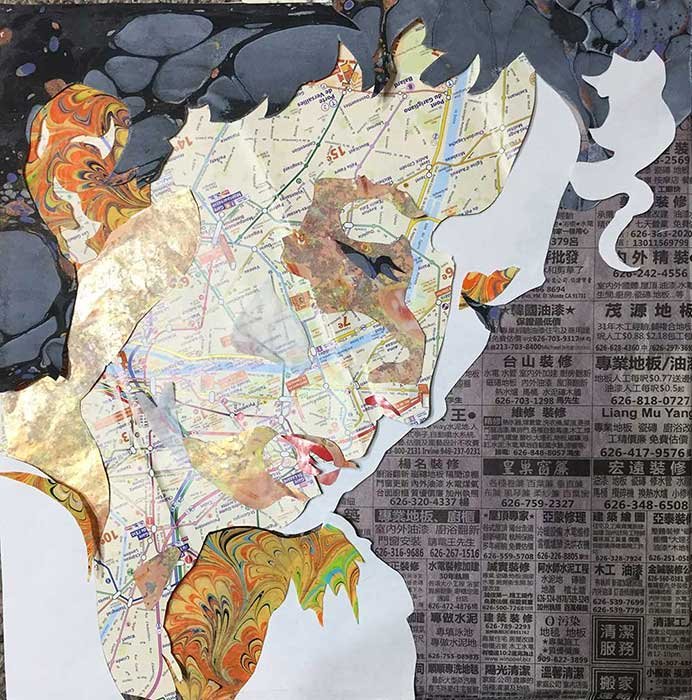
I’ve rearranged a bit and added a few more shapes for the final, below. Before attaching the map face, I ran a wash of orange watercolor over the profile. Notice I’ve simplified my shapes from the pattern — too many shapes can be less effective. I want large, medium and small shapes — the more varied they are, the more interesting.
Searching for a name, I realized the map I’d chosen was one of Paris that I’d picked up in my travels. The added color gave it a “HOT” feeling and I wanted to refer back to traveling because so much of my inspiration comes from that. Taking my final cue from the newspaper, I titled the painting “Travel Fever: Paris to Shanghai”.

Thanks to Sue Parman, for purchasing this piece, even before the awards ceremony. Yes, we both agree she has good taste!
Sometimes the question is asked, how long does it take to make a painting? The answer — it takes a lifetime! Without the experiences I’ve had up until this moment, what I’ve collected — memories, maps, marbled paper — and all the previous artwork I’ve created, I couldn’t possibly do the work I am doing now! If I added up just the hours spent actually making this collage and finishing the panel, it still took the better part of a day. But as with writing, it does speed things up to know what it is I want to say!
One other thing — while my work comes from within, it is also a product of the inspiration I borrow from everywhere around me. As you exercise your artist’s voice, I invite you to do the same…
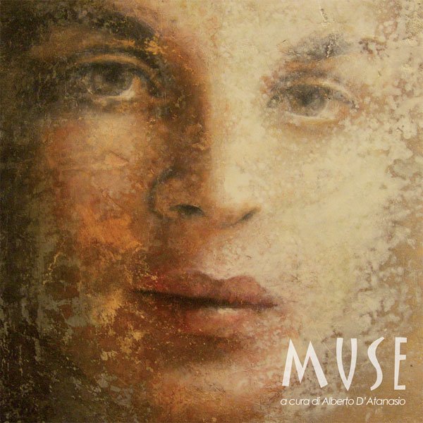
The concept of ambiguity has been resonating with me for some time — the idea that telling the whole story in a painting can be, well, boring, while omitting parts of it is intriguing. Ambiguity is engaging.
It invites viewer participation as we work to fill in the blanks. My visuals editor at the Oregonian, Michelle Wise, encouraged me to create interest with unfinished paintings that showed only part of the image.
After traveling in Italy, I have also been interested in creating the feel of antiquity and have been seeking a way to express that in my art. The first time I visited many years ago, Mary Lee Damutz took us to see a ruined chapel near Lucca with a blue fresco on the back wall. It left a lasting impression.

Then exploring a Tuscan village while leading a workshop there, I saw paintings by Stefania Orru in a gallery. Her contemporary works reminded me of the peeling layers of old frescoes found in Italian villas. Here is an example.
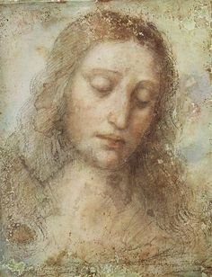
She may have been channeling Da Vinci‘s painting, above!
I’m not the only one inspired by these two concepts. After one of our Italian trips, my workshop partner Laura Shea made this painting, incorporating sheet rock mud and gold paint on canvas.

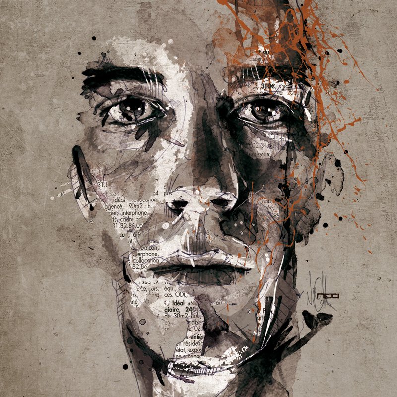
Here’s work by a French artist I just discovered on Pinterest last week, Florian Nicolle. I love how she includes newspaper and line in her work, with just a little color.
I finally had a chance to put my ideas to work last August. I’d been working with collage madonnas in Vera Dickerson’s workshop. Vera is also an wonderful instructor and here is an example of her work.

I wanted to include a portrait, and I already had one, a study that I’d painted in Lynn Powers’ first portrait workshop a few years ago, from a photo she supplied of her daughter, Kelly. I have always admired Lynn’s work and learned so much from her in a few short days. I am eternally grateful to have had the opportunity to study with Lynn. She was a master of color and technique and has left a lasting legacy.
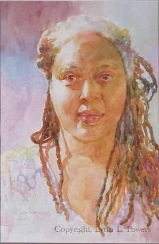
Here is one of Lynn’s paintings, “Woman of Color”.
I am the proud owner of this gorgeous print! You can find her prints available to purchase here:
So, I took my painting of Kelly and attached it to a 12×12 wood panel by American Easel. Then with a metal spatula I applied spackling paste — essentially sheetrock mud — allowing much of the portrait to show but covering the surrounding wood. When it dried, I liked the peek-a-boo effect with some of the portrait being visible. A wash of blue watercolor paint over the sheetrock simulates the blue fresco.
But it needed to be pushed further.
Having a stash of almost transparent marbled papers, I decided to imply a halo by adding bits of marbling to the background corners — essentially negative painting it with the marbled paper. Then I added a beige marbled paper with streaks of red and yellow ochre to create the illusion of shoulders and neckline. Squares of collage paper I’d made by adding Citrasolve, to National Geographic magazine pages were the final touches. Here is the result!

“Blue Fresco”
These experimental techniques are such fun to play with!
Two coats of Dorlands wax were then rubbed on the surface to protect it. This actually improved the effect by lifting a little of the spackling paste, increasing the translucency and allowing a bit more of the portrait to show.
The painting elicited many comments. Seeing it on a Facebook post, Jim Powers bought “Blue Fresco” for his daughter Kelly! He took this photo of me with the painting at the WSO Convention last weekend.
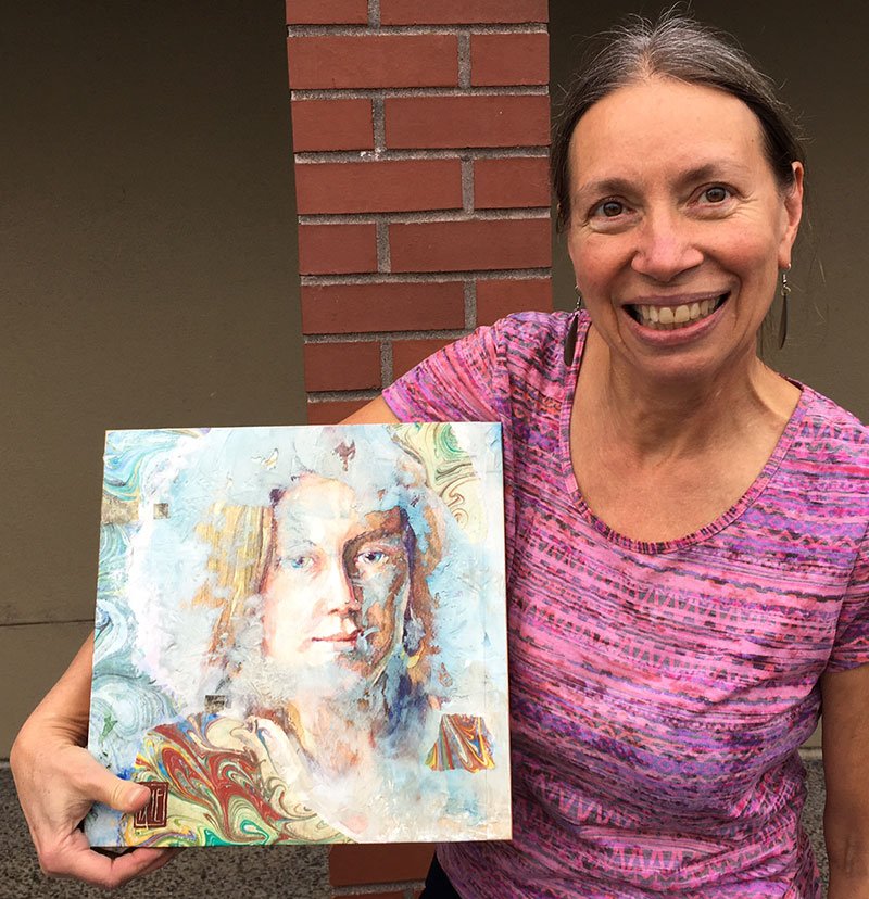
I feel so honored to have this art go to Kelly and her family.
It’s good to seek inspiration from all around you, then find unique ways to translate it into your own work.
Experiment and play! Everything you do today informs your future work.
I look forward to discovering new ways to use these concepts of ambiguity and antiquity.